want some cookies?
We use cookies to make your browsing experience amazing.


Ever heard of banner blindness in L&D? No? Well the bad news is, if you haven’t heard of it, the chances are you’ve fallen victim to it. When it comes to marketing for learning, L&D professionals often search for ways to make their lives a little bit easier. Quick wins. Templates. Hacks. Anything just to make the process quicker. But in an attempt to save time, L&Ders often fall into a trap of using the same template, email layout or image design time and time again. And this little mistake could be detrimental to your marketing success – it could be causing a form of banner blindness.
WHAT IS BANNER BLINDNESS IN L&D?
Banner blindness in L&D occurs when learners subconsciously ignore repetitive templates, imagery, or emails, reducing the effectiveness of learning communications.
BANNER BLINDNESS IN ACTION
One of the most famous examples of banner blindness is from Google. They used to have ads all along the right-hand side of their search results (as well as at the top and the bottom of the page!) Google did a lot of research with heat mapping and eye tracking to see what users actually looked at – and this showed that in many cases, users hardly looked at the adverts at all. Which of course means clicks on these ads were minimal too!
We know you probably don’t advertise your learning content on Google, but that doesn’t mean you’re exempt from this phenomenon. In fact, banner blindness in L&D is a huge problem. Humans – and that includes your learners! – have become very good at determining what information they want to absorb. If we think we’ve seen something before and we know what it’s trying to tell us – we’ll subconsciously ignore it. So when we try to save time by using templates, imagery and layouts repeatedly – we may be pushing out content that our target audience is simply not absorbing.
GRABBING ATTENTION WITH VISUALS
It’s not just L&D that falls victim to this, take this example from the supermarket Sainsbury’s. Like many shops and public spaces, Sainsbury’s had posters up reminding shoppers to read face coverings during the Covid-19 pandemic. But after a year of perfectly on-brand posters, they changed them all to bright blue in February 2021.
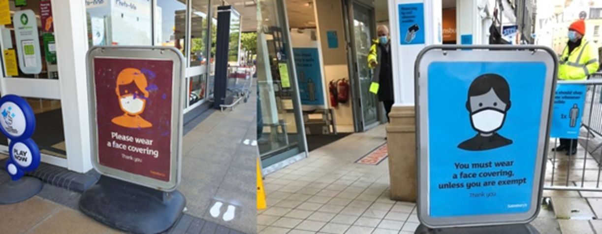
No, Sainsbury's marketing team didn’t have a complete bypass of their senses and forget their brand guidelines. This was a deliberate move, as they realised that these health-critical posters blended in with almost everything else in their store. And because of that, shoppers started ignoring them.
We see this repeatedly in L&D. Banners, emails, and posters – all looking very similar. This leaves your audience thinking “I’ve seen/read that before, I don’t need to look at it again”.
5 WAYS TO PREVENT BANNER BLINDNESS IN L&D
So, the first step to overcoming banner blindness in L&D is being conscious of it. The sheer fact of knowing this phenomenon exists, you’ll stop being so repetitive in your marketing! But beyond that, here are 5 ways we can prevent banner blindness in L&D:
SWITCH UP YOUR IMAGERY
If you’re trying to disrupt and grab the attention of your learners, you cannot keep using the same imagery over and over again. In fact, this is how you can guarantee you will fall victim to banner blindness in L&D. Even if you’ve changed everything but the image, your audience will see the image, assume they’ve seen it before and ignore it. Make use of your entire image library (speak to your marketing team!), or free stock imagery websites such as Unsplash, to keep your content looking fresh.UNIFY YOUR BRAND IDENTITY WITH COLOUR
Oftentimes in L&D we are obliged (or forced 😉) to use our corporate brand guidelines, which limits our ability to stand out. One great way to overcome this is to look at your corporate colour palette, and choose a lesser-used colour as YOUR colour. Claim it. Mark it as your own. And it’ll make your marketing stand out.DEFY EXPECTATIONS
Take a second to picture the last email you sent out to your audience. What did it look like? Does it have a banner image at the top? Probably. A body of text? Yep. A big button telling you to do something? Of course. Most emails – particularly in a corporate marketing environment – look just like this. So defy expectations. Design yours differently. Put the text first and the image second. Use a gif. Switch it up!ANSWER THE ‘WHAT’S IN IT FOR ME?’
Answering the ‘what’s in it for me?’ (WIIFM) enables you to tap into your learners' pain points is a sure-fire way to grab attention and make your marketing stand out. If you put your audience at the heart of everything you do (your learning offering, design choices and copy) you will compel your audience to engage with your marketing (and your learning product!)DITCH THE PROGRAMME-BY-PROGRAMME APPROACH
If you’re consistently putting out messages saying “take this learning” or “new course available in the LMS” your audience will quickly get bored and start ignoring you. So instead of being so ‘on the nose’ all the time, think about marketing your learning brand. Share ideas and stories about leadership who have progressed their careers through your academies or telling user stories about successes. Hey, using influencer marketing is also a great tactic here – get your star learners to amplify your message for you! (L’Oreal does this fantastically, you can find out more about that on the marketing for learning podcast!)
BUT WHAT ABOUT BRAND CONSISTENCY?
Addressing banner blindness in L&D can often lead to confusion about brand consistency. And in some ways, banner blindness can seem like an oxymoron to consistency. Because when you’re trying to establish a brand, you want to consistently represent it, to make sure it sticks. But you can do both simultaneously.
HOW TO ENSURE CONSISTENCY BUT AVOID BANNER BLINDNESS IN L&D:
Let’s look at our marketing here at MAAS as an example, these are three recent images from our LinkedIn posts:

You can immediately tell they are all from the same brand, as they all have:
Our bold, unique font and a word highlighted in a contrasting colour.
Vibrant backgrounds (apologies to your retinas)
Our logo (obvs 🙃) and our key brand code: the pineapple.
But these images do not look the same. Nobody would see one of them, and assume they’d seen the other two. If they were all on pink backgrounds with a graph, they might blend into one. But you can see how we’ve used different formats and styles on each, to keep them unique.
This is what we must begin to do if we want to overcome banner blindness in L&D marketing. Yes, consistently present your brand. But NO, do not use the same colours, layouts and imagery over-and-over-and-over again.
IT’S TIME TO THINK OUTSIDE THE BOX
Banner blindness in L&D is a huge risk to the efficacy of your marketing. Your audience has a short attention span, and a lot vying for their attention. So make sure your marketing stands out amongst the noise. Make it impossible to ignore. Be different. Try out different layouts, templates, imagery and sizes. Even with very tight brand guidelines, there are many ways you can overcome banner blindness in L&D, so make sure you keep this phenomenon in mind and don’t let your marketing for learning efforts go to waste.